Creating a database for a UX research repository

Your team needs a UX research repository. Here’s how to build one.
Research documents from past projects are like instruction manuals for electrical appliances. They provide valuable information, but can be elusive when you actually need to refer to them!
Modus’ exponential growth has deepened the ocean of reference materials for our UX teams to wade through. While our #help channel in Slack is useful for directing people to the right places to look, this process takes time and is dependent on team members’ recollections. And like IKEA manuals, there’s important information that’s not always captured in existing research documents - research outcomes, the number of interviews done, the client’s industry, etc. For new Modi (what we call our colleagues at Modus), there is also value in simply wandering through the woods and gaining familiarity with past work, particularly during the onboarding period.
Problems are the catalysts for solutions, and we found inspiration in ours to ideate solutions for a UX research repository. It had to be a lean (although not mean) machine that could help people more effectively locate what they were looking for. Typically, UX research repositories contain two categories of information — information for designing and conducting research, and the findings and insights from that research. It’s a tall order. Before we started ours, we spoke with our colleagues and discovered a clear need that helped us prioritize what to build — Modi wanted to learn how effective user research is conducted.
For now, our research repository primarily focuses on providing information for designing, conducting, and presenting research, and less on providing final insights. However, we wanted to ensure people could locate research findings as needed, so we devised a workaround — a folder of final presentation decks that served as templates and summaries of key findings and recommendations. Talk about multitasking! The repository currently consists of three parts — the above mentioned folder, a searchable database of past research projects, and an overview of current UX research tools in use.
Building a searchable research database was a particular challenge when it came to deciding on content to include and exclude. We have learned a lot on the journey, and are excited to share our process here!
The back-end work
Understanding users’ needs and visions for the UX research repository
We began with the end — our colleagues who would be eventual users — and spoke with new and senior team members to understand their visions for a research repository. With recent hires, we were curious about the following:
- What resources did they use when preparing for a new project?
- What past research repositories had they used, if any?
- What did they like and/or dislike?
With senior team members, we wanted to know the following:
- What other uses did they envision for the UX research repository?
- Were there any research projects they thought were good for inclusion in a proof of concept for the repository?
These conversations gave us a better sense of the types of information that was important to capture in the repository.
Deciding on a platform
Since most of our information is hosted on Google Drive, we continued with it as a central hub for organizing the three parts of the repository. We then began weighing options for a database platform. Google Sheets and AirTable were in the running, each with their pros and cons. To avoid reinventing the wheel and building out a separate search function, we decided to go with AirTable for its greater database functionality and in-built search interface.
Designing data categories for the database
Writing is designing, and metadata conventions go a long way in shaping the usability of a database. Our categories arose organically from conversations with colleagues, and we learned that the database had to provide filtered results by methodology, in addition to other filters such as industry, client, and product deliverable, to best meet their needs.
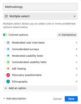
And if you have ever gotten confused by why “football” players are kicking a black-and-white ball about, you know the importance of using consistent terminology to refer to something. Our repository adopts controlled vocabulary for search categories, and sets data entry fields to either single select or multiple select to avoid any inconsistencies in search results.

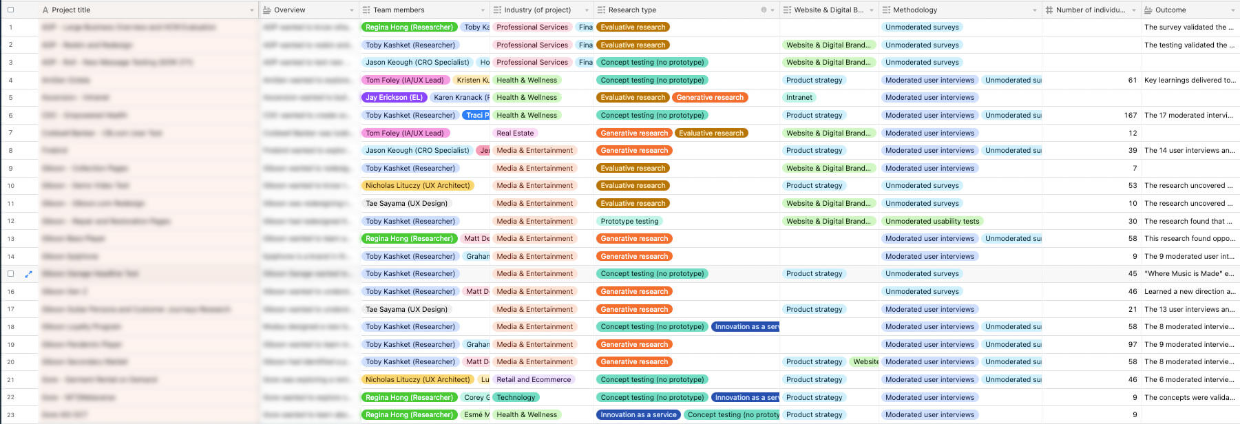
Aside from incorporating names for common UX research methods, we also referred to existing internal databases for useful categories and terms. Currently, our database has the following categories:
- Project title
- Client name
- Project folder link
- Document type
- Document link
- Year of project
- Team members
- Overview
- Industry (of project)
- Research type
- Product deliverable type (website/app etc)
- Methodology
- Number of individual interviews
- Outcome
The last two categories, number of individual interviews and outcome, arose during our conversations with senior Modus members as metrics for evaluating research impact.

Entering data and identifying data sources
Two issues we ran into as we were entering projects into the database were one, overlooking past research because there were no standardized document names, and two, omitting team members’ names by accident because we were referring to kick-off decks which did not always capture the full team (particularly as the project grew in scope).
To minimize these issues, we have triangulated our data sources as far as possible, reached out to team members to gather more details about the project, and continue to update the entries whenever errors are pointed out to us.
The front-end look
Customizing a search interface
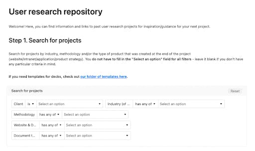
A spreadsheet is useful for data entry, but it’s not as helpful when you actually need to filter results by several categories. Enter a search interface. AirTable came with an in-built interface function, so creating one only took a few minutes.

Creating a form for future project submissions
To remain relevant, a database needs to grow its data. We have created a simple form with only a few required fields to facilitate this process of submitting completed projects. Although some information might be omitted as a result, we decided to not let the imperfect be the enemy of good. We also thought it a good trade-off if it made incorporating the step as part of a project management lifecycle easier.
The idea of the database has been received warmly so far, and we are excited to continue developing it further. Historian Arlette Farge describes the feeling of being in an archive as something akin to an immersion in something “vast, oceanic”. More than just old stuff, Modus’ research documents are the rendered traces of otherwise invisible creative thinking, and each dive into past research to inform present work invokes a similar feeling of wonder!


