How We Reimagined the Modus Digital Experience


Selena Ricks
Brand and Marketing Communications Lead


This year, 2020, just so happens to be the 20th anniversary of Modus. As we approached this milestone, it became even more important to us that our visual identity reflect the evolution of our agency as a partner in building digital experiences for the world’s leading brands.
Today, we’re thrilled to announce a new look and feel for Modus: modusagency.com
Why did we decide to do a redesign? As a busy, full-service digital agency, we know that a website and brand refresh is no small project. It requires planning, research, strategy, design and development resources, and most of all — time.
We couldn’t wait to get started on reimagining how to showcase our best portfolio and all of the genius things that our agency can do — but first, we needed to give pause to answering the question of “What is the Modus story at this moment in time? And why should people care?”
It started with a story
As we approached 2020, we took stock of the collaborative culture and innovative work that got us to where we are today. Looking back, so much has changed in the digital and marketing landscape in 20 years. Before virtual reality was a thing, Modus’ first client turned to us to ‘think without limits’ and create a virtual showroom for their designs. We delivered an online room-design tool (a version of which is still in use today) that enabled customers to plan out their space without having to leave their homes.
As our agency has evolved and expanded our technology, creative, and strategy services, our mission has grown as well. Now, more than ever:
- The human experience is at the core of all we do
- Our expertise in strategizing, designing, and building sophisticated digital products and platforms truly moves businesses forward
- Our culture is built on teamwork, respect, and recognition
In revisiting our history, it was important that our unified brand story was reflected in our creative and content strategy before architecting and designing the new site. What emerged was a story of “People + Product” — a simple but powerful notion that highlights our focus on the human experience through digital engagement.
The importance of showing as much as we tell
As a B2B digital agency, we, of course, also needed our new website to support our marketing, sales, and recruitment efforts and to grow our business. The best way for us to do this is to “show — don’t just tell.” We took some time to curate our vast portfolio to showcase some of our truly innovative work — our greatest client successes that not only look good and perform well, but, more importantly, drive real business results.
We also wanted to highlight our deep expertise in key industry verticals, including: financial services, health and wellness, and real estate.
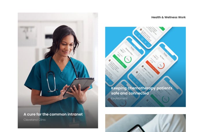
Of course, Modus is a “one-stop shop” that caters to a wide variety of clients, but we’ve also gained a tremendous amount of insight working within certain industries for years, or even decades. By creating industry-focused pages, we’re better positioned to show our expertise and validate why we are especially suited to help in these specific areas.
Built to scale (and delight)
We needed our new site to allow for quick and easy updates by our marketing team, as well as content expansion and evolution without too much fanfare.
As part of our development philosophy — we believe in a technology opportunistic approach — that is, selecting the right tech stacks based on the designs and the predominant business goals we are trying to achieve. As we do for our clients, we evaluated different tech stacks and content management systems before selecting our tech stack for our site: Prismic, a SaaS headless CMS, GatsbyJS — an open source build framework, and static HTML and CSS hosted on AWS S3.
You can read more about how to choose a CMS, and about our preference for headless CMS for content management, but essentially we doubled-down on our enthusiasm for a flexible, component-based approach. Typically, in order to support a “build pages with lego-style components” mandate, we would use a home-brewed platform. However, in the interest of speed, independence, and expediency, we went with Gatsby, which has been an excellent choice and is gaining traction in the larger development community as a pairing with headless CMS.
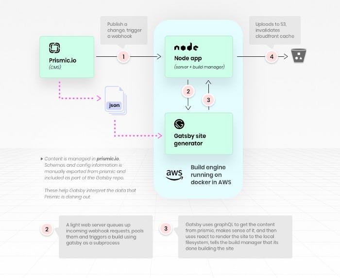
Gatsby is a static site generator that can compile sites with data anywhere on the web.
The most attractive feature of Gatsby is overall site performance.
Gatsby achieves this mainly by:
- Creating a static site: This means that when the page loads, all the data for the page is already in the HTML. There is no going to a server and requesting the information/data that the page needs. Take, for example, our Work page: on a traditional website, when you load the page, we would have to go to a server and get all the projects. With Gatsby, when you load the page, all the projects are already there. Gatsby fetches all the information at build time and creates HTML that has all that project information already there.
- Code splitting: This means each page only loads the things that it needs, not more. In contrast to other technologies, you won’t be loading a massive pile of JS on every page.
- Image compression: Images can be optimized at build time to have the right size, without compromising quality, and they are responsive out of the box. They are also always ‘lazy loaded,’ which means it will not affect the first render time.
Unlike a traditional CMS such as Wordpress, with a headless CMS, such as Prismic, simple authoring experience is a key feature. In Prismic, for repeatable content types such as blog posts or case studies, we can use Content Slices.
Slices make it possible to have very flexible content layouts and enable content creators to organize and create new pages with a lot of control over how they look. An example of that for us was our team profile pages. Before we had final designs for these pages, our content team was able to build them using the Slices we had already created for the rest of the site, without needing help from the development team.
To power the smooth animations that add moments of delight, we used a React library called Framer Motion and the Intersection Observer API to identify when an element enters the viewport to trigger entrance animations.
Agile and evolving
Websites are living, breathing things; they can and should be updated and optimized continuously. In the coming weeks and months, we’ll roll out updates as planned and tweak things as we learn from our analytics. We’re excited about what our team has achieved in launching our new site, and we’re eager to continue improving upon it.
A huge thanks to our redesign team: Kristen Kulenych, Abigail Stock, Luciana Boasso, Hope Reagan, Juan Pedemonte, Juan Solano, Xavier Otero, Juan Speziale, Asim Mittal, Tae Sayama, Luis Sanchez, Selena Ricks, Graham Ericksen, John Paul Ramos, Dave Gould, Kristina Vogel, Tom Foley, and the entire Modus team!

